SocialHub navigation
Harri’s employee app has five things in the bottom bar: Home, Schedule, SocialHub, Rewards, More. SocialHub is one of them. Inside it sit four more: News feed, CommsHub, Community and Knowledge base.
That is two levels of navigation asking for the same bar.
Mhamad Jarrar and I worked on this together. We defined the problem and found the direction as a pair. I designed the approaches and the screens, and built the clickable prototypes.
What was actually broken
At 390pt the four module tabs do not fit. Community gets clipped and the bar scrolls sideways, so one module is always off screen.
CommsHub then stacks a second row of filters under the tabs: All, Unread, Groups, Touchpoints. Two rows of navigation before any content starts.
And there was nowhere left for search, filters, or a way to start a new chat. The header was already full.
Counting before designing
Before designing a single bar I listed everything SocialHub has to hold. Twenty three things already existed: stories and the full screen story viewer, posts with photo, video and text, hashtags and mentions, like, comment and share, one to one chats, group chats, five message types including polls and attachments, filter chips, unread badges, touchpoint check ins with a 1 to 5 rating, birthday gift cards, bot messages, joined groups, recommended groups, group detail with its own stories row and feed, and three sections of knowledge base content.
Then three the current design had no room for at all: search across modules, a filter per module, and a new message button. Twenty six in total.
Then I built a matrix: every item, every approach, where it lives. It is a boring table and it did most of the work. An approach that cannot say where all twenty six things go is not an approach yet.
Seven ways to fit it
Each one got three screens. Enough to show structure and placement, not polish.
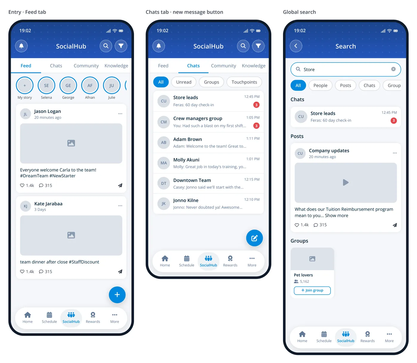
Refined tabs. Keep the four top tabs and shorten the labels until they fit: Feed, Chats, Community, Knowledge. Move search and filter into the header. Cheapest to build. Chats still stacks its filter chips under the tabs, and shorter labels need sign off from the people who own those names.
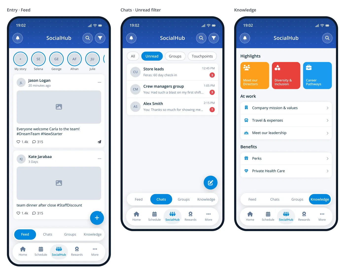
Double navigation. A segmented module switcher docks right above the bottom bar, so the header carries only the title, search and filter. Two stacked bars eat about 100pt and crowd the create button.
Stand alone tiles. SocialHub opens a list of four tiles, and each module is its own screen with a back arrow. Very clear. It also adds a tap to everything, and the landing screen is mostly empty.
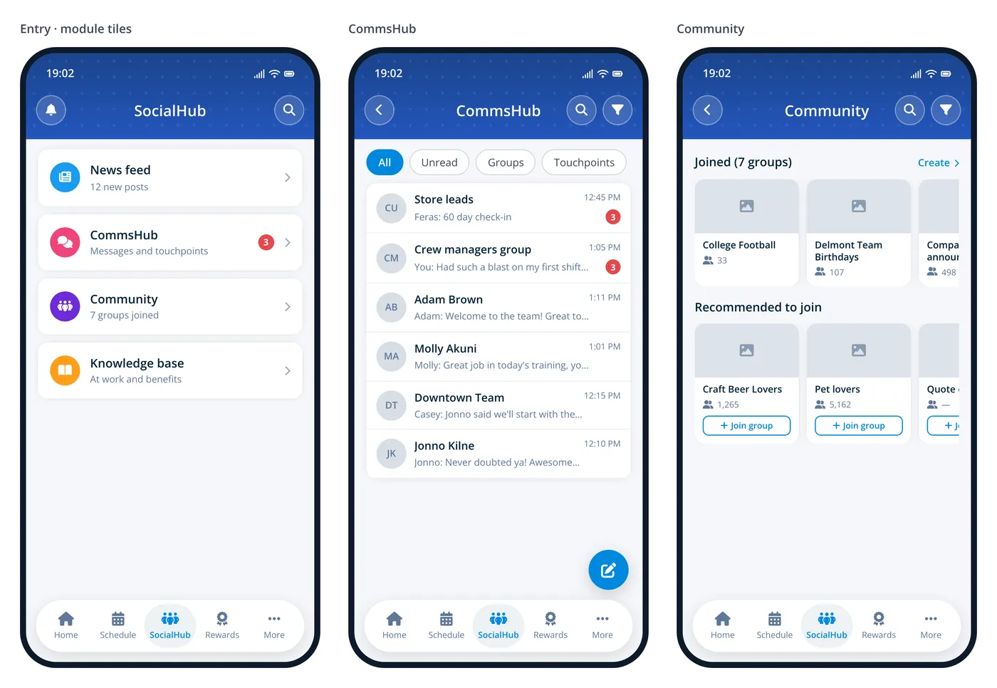
Dashboard. SocialHub opens a summary: a stats card, then a section per module with View all. Reaches a chat in two taps instead of three. It is also the biggest build, and it needs a summary endpoint for every module.
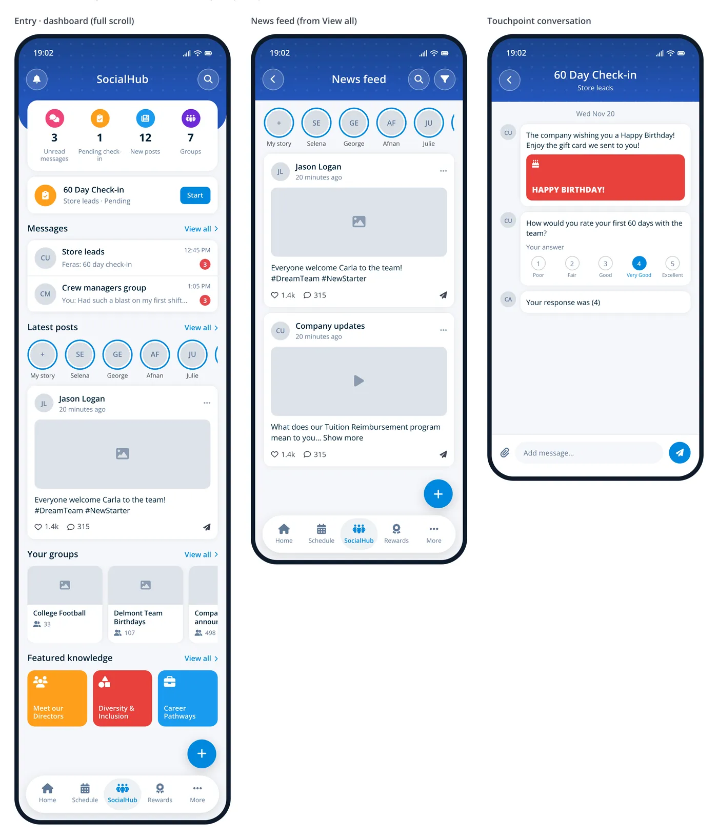
Action menu. Tapping SocialHub opens a sheet to pick a module, the same pattern the app already uses for Manage schedule. The module name sits in the subtitle with a caret to reopen the menu. The cost is that the nav item stops behaving like a tab.
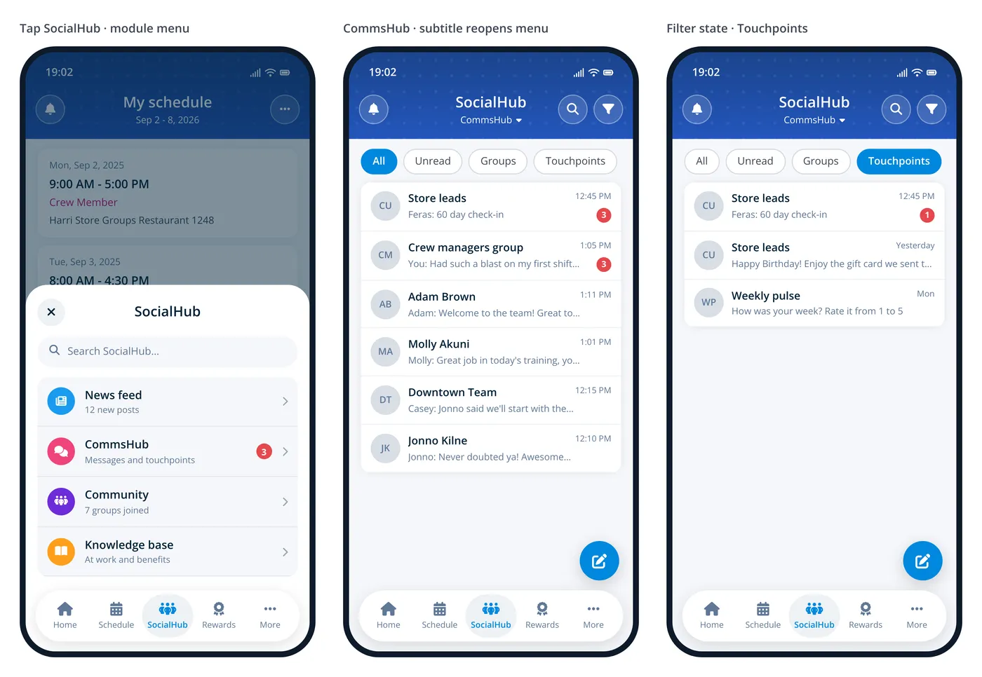
Move the feed to Home. News feed and stories move under the next shift card on Home. SocialHub is left with three modules, which fit as full labels with room to spare. It changes Home, and the feed then competes with shift content.
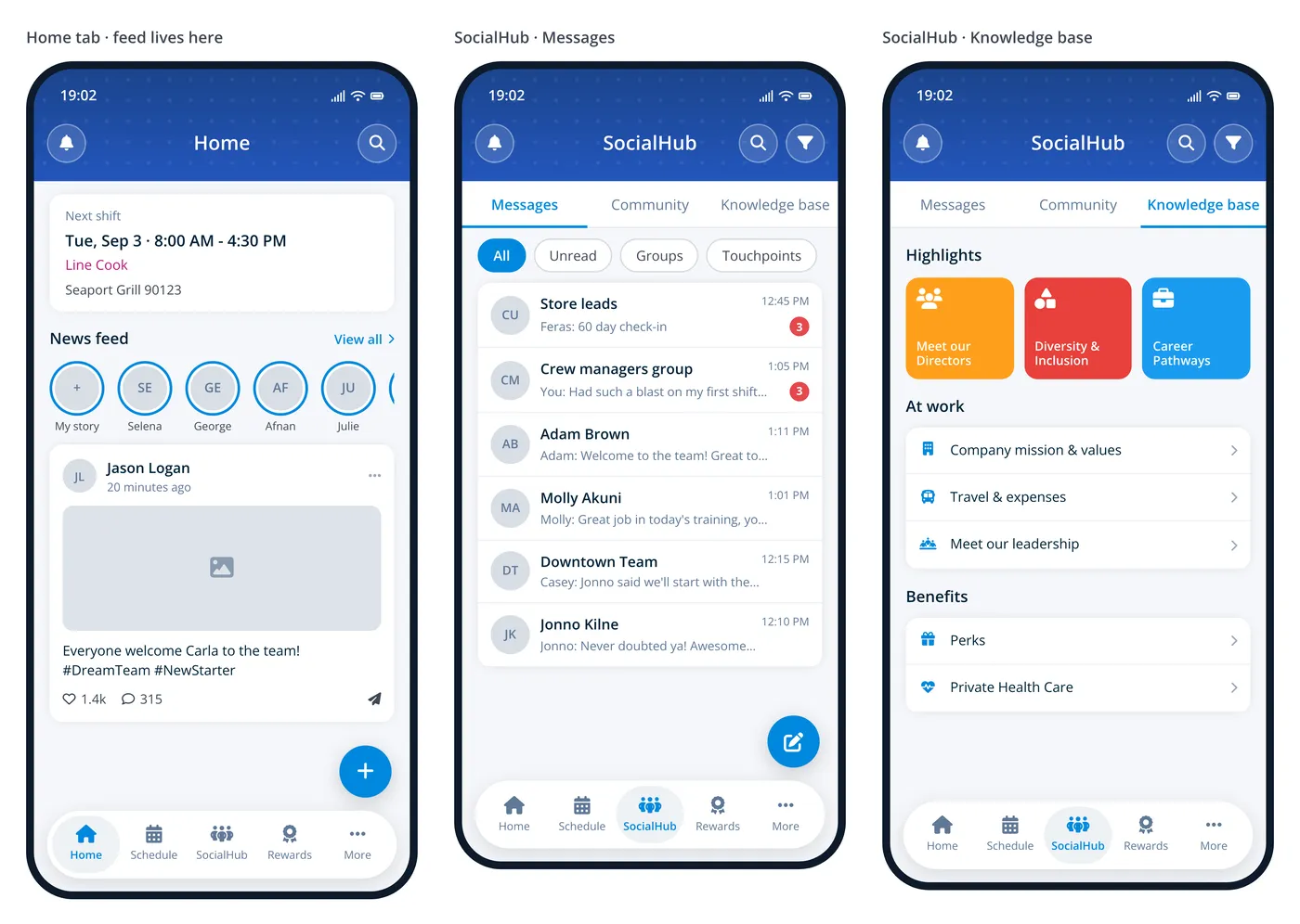
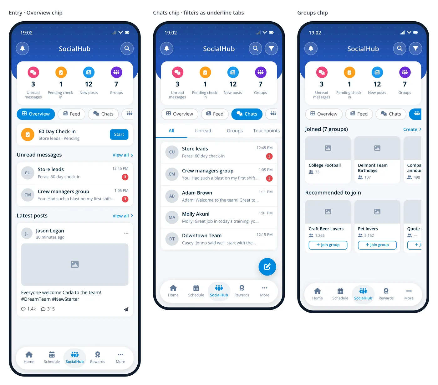
Overview plus module chips. A summary card, then icon chips that swap the content below without leaving the screen. Five chips scroll sideways, and Chats still needs a second filter row.
The floating switcher
One concept went to a second round in full detail: a floating pill above the bottom bar showing the current module, which expands in place to switch between all four. The interaction is borrowed from Tripadvisor’s List and Map pill.
I designed twenty five screens for it. Resting, expanded as a vertical stack and as a horizontal row, shrunk to an icon on scroll, and hidden behind a chat, a keyboard, a story and full screen media. Plus search and filter for each of the four modules. Every tap target is 44pt or larger.
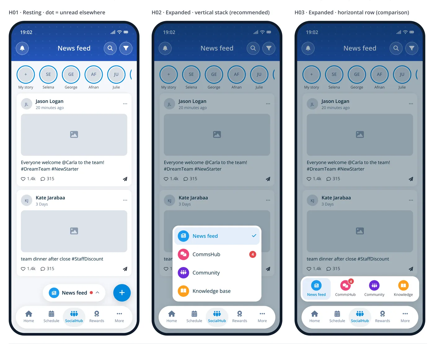
It reads well on paper. Content gets the whole screen, there is no tab bar and no second nav row, and a fifth module would be one more row rather than a layout change.
It also hides three of the four modules behind a tap. A first run hint teaches that once, and after that someone may simply never find Community or Knowledge base. That is not something a good animation can fix, and it is why this is not one of the two we are testing.
Nested bottom navigation
The one that became a working prototype does something the platform does not normally do.
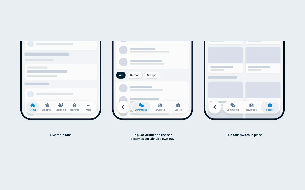
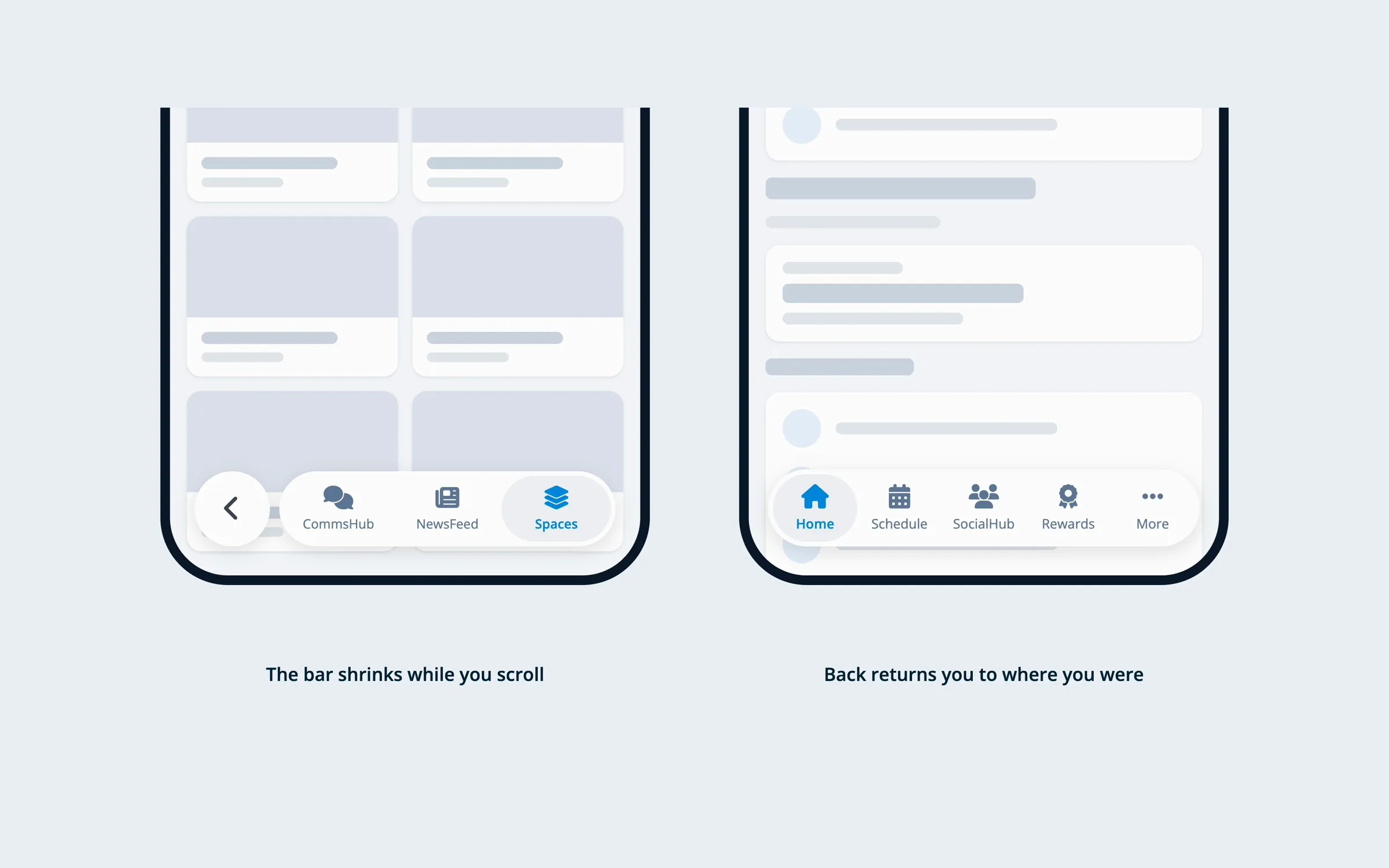
Tap SocialHub and the main bottom bar becomes SocialHub’s bar. A back circle appears on the left, the bar narrows, and three sub tabs come in: NewsFeed, CommsHub and Spaces. Spaces holds Community and Knowledge base as underline tabs. Tap back and the bar returns to the five main tabs, on the screen you left.
Every module is one visible tap away. Nothing is buried in a menu, there is no top tab bar, and content starts right under the header.
Motion did the explaining
The first version used spring easing and short timings. It felt jumpy. It swapped one navigation state for another without saying anything about where you were going.
The fix was slower deceleration, slightly longer timings, and a stagger. The final transition runs 400ms end to end and overlaps five things: the other tabs fade and slide 18pt apart, the active pill slides from 16pt to 88pt, the back circle fades in and scales up from half size, the sub tabs rise 8pt and fade in 40ms apart, and the grey selection pill slides across to the new tab. Reversed on the way out.
The stagger is the whole trick. It turns a swap into a sentence: this bar is becoming that bar.
With reduced motion turned on, all of it becomes a 150ms crossfade.
What the comments found
Mhamad took the prototype public in a post on LinkedIn, and the comments went straight to the two weakest points. That is the most useful thing that can happen to a concept.
Two people independently said the same thing about the tab itself: nothing on SocialHub tells you it holds a second level, so you find out by accident. A hint after you land helps, but it cannot set the expectation before you tap.
Someone else went after the back arrow. Where does it take me, the screen I came from or Home? That matched what we had already written down as the main risk. There are now several kinds of back in one app: the circle in the nav, the header back on pushed screens, and the system swipe. Each does something different.
Then the platform point. iOS 26 supports a floating tab bar that shrinks on scroll and hides on detail screens, so the shape is native. Swapping the bar’s destinations and putting a back action inside it is not. Apple’s guidance keeps tab bar destinations consistent.
Where it stands
We are testing this against the conventional answer, which was one of the seven: keep the main tab bar the same everywhere, and put SocialHub’s sections in a segmented control under the header. More predictable, less immersive.
The new pattern does not win by being new. It wins only if it tests clearer. Seven approaches, two concepts in full detail and a working prototype exist so the choice gets made on evidence instead of taste. Right now the evidence is still coming in.
If you want to argue with any of it, the thread on Mhamad’s post is the right place. The discussion is still live there.